The Share page is on the move
Update to the Intuto Share pageAfter a lot of customer feedback and discussion we have decided to move the Share page away from the course publish...
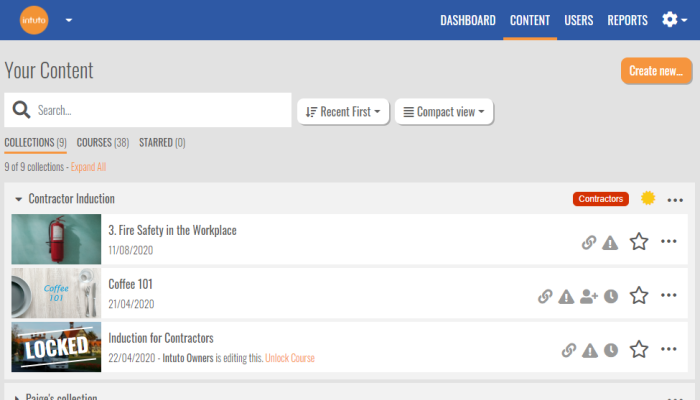
We are excited to announce the release of a brand new content page that integrates collections and courses in a single place.
It can be a tricky balance to continue to add new functionality and keep Intuto easy to use. This is why when course collections first came out, we put them under settings and assumed that it would be an advanced feature.
As it turns out, 80% of our customers use collections as they provide flexibility around ordering courses, automatic certificates, learning pathways and completion notification. Find out more about collections here. We love seeing features being used - so now is the time to bring Collections out of the shadows and into the light on the main Content page.
The first thing you'll notice is we have added groupings at the top of the Content page so you can view your courses by Collections, Courses or Starred (there will also be options for Invites, Enrollable Courses and Campaigns if applicable).

The Collections view displays courses by collections. When logged in as an admin you can see the user groups associated with the collection and whether it has a certificate attached.
The first collection will appear expanded by default and you can expand other collections using the small black arrow next to the collection name.
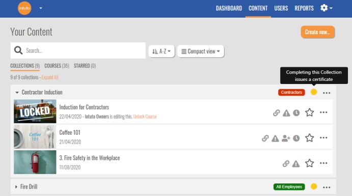
You can also Edit, Share, and Report on the collection right from the content page.
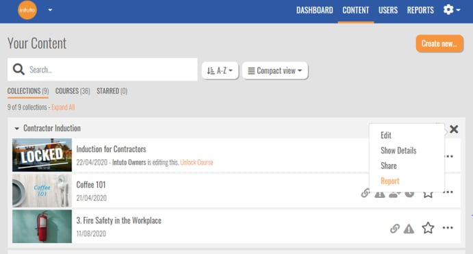
You can make the Collections view the default view for all users in your site under settings (you need admin rights for this).

After feedback from users who have found it difficult to find their frequently used courses, we have added the ability to Star courses. This is achieved by clicking on the star to the right of the course name.

Starred courses will appear in the Starred view for easy access.
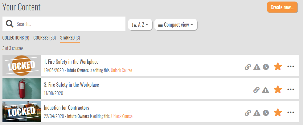
As part of the new design we looked at ways to fit more courses on the screen without scrolling. We have therefore added a Compact view to the content page, which is available via a dropdown next to the search bar.

The Compact view shows less options to admins, but allows for more courses to be displayed in the list before scrolling. The extra options are still there - they are just behind the three dots on the right.
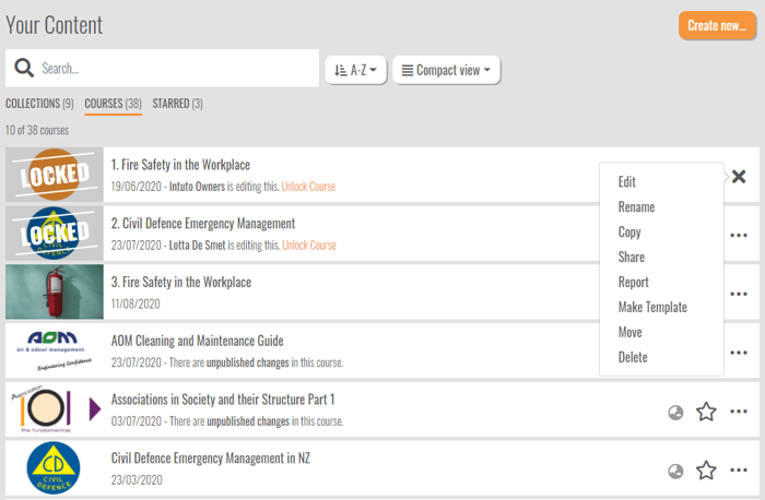
The existing view has been tweaked and renamed Expanded view.
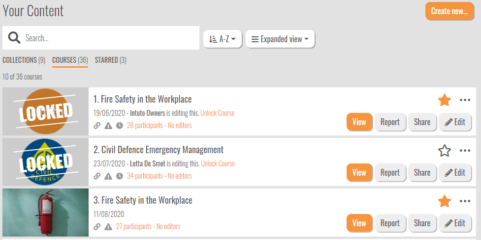
We have also added in options to sort your Courses / Collections.

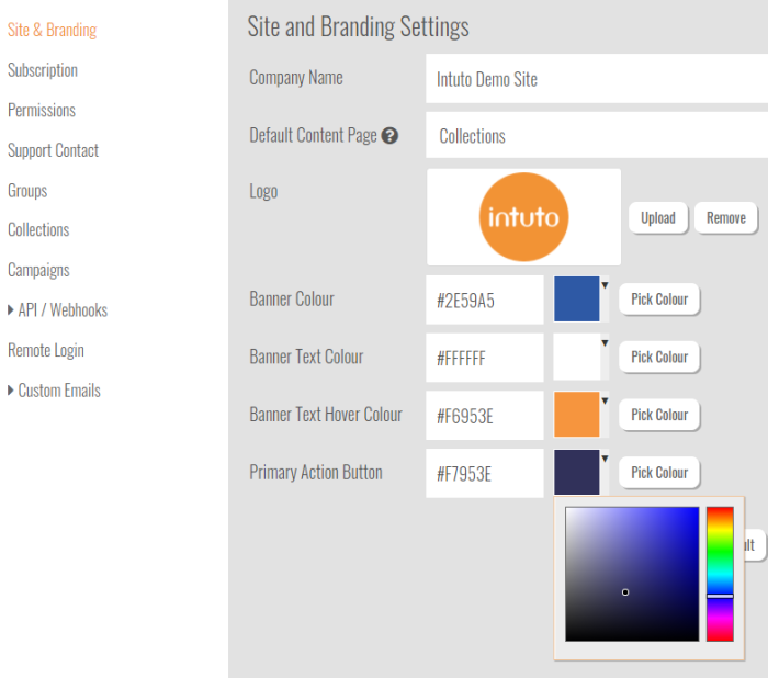
The ‘action’ buttons on the content page will now take on the colour selected in Primary Action Button under settings allowing you to further align your Intuto site to your own brand.
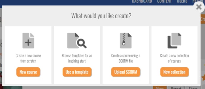
Using the Create New button you can choose what and how you want to create a course or collection. This now has up to four options:
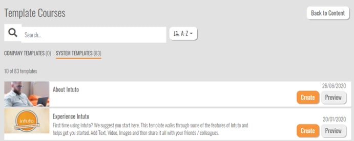
Templates are a great place to be inspired or to leverage some existing quality content. The template page now has search and sort functionality to help you find what you are looking for.
As we were working through the new content page development, we also realised that some of our naming was inconsistent and didn’t reflect how our customers refer to parts of the system. To ensure consistency we now use the following terms.
We hope you enjoy the new content page and as always we'd love to hear your thoughts.

Update to the Intuto Share pageAfter a lot of customer feedback and discussion we have decided to move the Share page away from the course publish...
Welcome to the first Intuto update of 2018! Over the break we have been busy improving and adding to the Intuto Reports, building the ability to...