Embracing Digital Transformation for Association Success
Modern technology is essential for all modern businesses and organisations.
The Intuto development team has almost 40 years experience, almost all of which is in developing online learning systems (learning management systems, content management systems, course authoring tools). Over the years we have learnt a lot, including to hate IE6, love javascript and most importantly that cool technology is no good if users can’t understand how to use it without reading a huge manual.
Over the years we have tried lots of different scoping methodologies. Ultimately we came to the conclusion that getting users involved early and often was the best approach where possible, so we came up with a modified agile methodology for our development.
As for user experience, we have used lo-fi prototyping as a great way to ensure usability and intuitive design for many years now. In Lo-fi prototyping the proposed system's user interface is made from paper and tested with real users (with no actual computers or technology) to achieve the goal the system is designed to achieve. This allows observation and understanding about what the user expects without anyone getting distracted by colours or the technology itself. For a short intro, check out http://www.slideshare.net/InteractionDesign/lo-fi-prototyping.
For the Intuto product we wanted to make sure we scoped it effectively, ensuring we could achieve our goal of a simple, fun tool for anyone who wants to put knowledge online. We had lots of great ideas for features, we had a good team with plenty of experience in online training and we had the technical know how, but how did we make sure we built the best possible system?
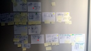
After extensive reading, we ended up taking the design sprint idea from Google Ventures and modifying it to fit the scope of a whole system. As expected this took longer than a design sprint for a single feature, but after a few days we managed to get walls covered with ideas (some great, some good, and some bad). From there we were able to identify the parts we knew would make Intuto simple and fun for our users.
Thanks to the hard work of our lead developer, within two weeks of the design sprint we had a working prototype that proved the most important (and clever) parts of the system would work, and work well! (more on the prototype in my next post).
Next we handed the desired feature list and the room full of ideas to the development team. They spent another couple of weeks ironing out each feature in detail, including lo-fi versions of all screens...Intuto was slowly coming together.
If you haven't already, don't forget to sign up to ensure you get a place in the intuto meta launch

Modern technology is essential for all modern businesses and organisations.
As mentioned in the previous technology post, many months ago a prototype was built to prove the most important (and clever) parts of the system. The...

I have always enjoyed learning new things, especially in education, so I was very lucky to fall into the perfect role 16 years ago when I came back...